How fonts reveal personality
Posted in Marketing and social media
“A picture tells a thousand words”. That’s the saying, right? When it comes to branding, a lot of that branding is communicated through visuals. Some schools of thought say that the bulk of a brand’s message should be presented through its visuals with text only serving as accompaniment. However, think about the shape of words. In a way, text can be visual as well, incorporating styles and colours. Fonts play a role in this.
While fonts may not seem too consequential, they convey meaning. People’s brains are wired to interpret different fonts differently. For example, look at this sentence written out in different fonts:
Which one seems most fitting? Now look at a different sentence:
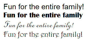
Which one seems most fitting? Chances are that you chose two different fonts as being fitting for the two different sentences. Can you explain why that is? If your answer is “because it just seems right”, then that embodies most customer perceptions of the font. People know what feels congruent and what doesn’t. As much as choosing a font is an artistic decision, there’s a logical reason for choosing certain fonts over others.
Serif Fonts
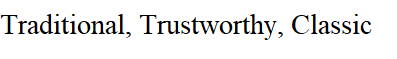
Traditional, trustworthy, and classic. Serif fonts invoke feelings of respectability making them perfect for formal contexts or for seeming authoritative or grandeur. Businesses who want to build brand awareness through trustworthiness benefit most from serif fonts. Due to their classic feeling, they are also good for conveying brands that are “established”.
Serifs refer to the little extensions of a letter at its ends. It was initially used to increase readability, but now plays a dual role in describing heritage. Examples of serif fonts include Times New Roman, Baskerville, Lora, EB Garamond. Brands like Vogue and Times Magazine use such fonts.
Slab Serif Fonts
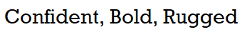
Confident, bold, and rugged. Slab serif fonts invoke feelings of the classics but modernised. Businesses that want to emphasise the “established” nature of the brand while hinting at innovation might use such fonts. These fonts feel solid and confident and brands that want to appear bold will appear that way through use of these fonts.
Slab serif fonts are sometimes considered a subset of serif fonts as they too have serifs. The main difference is the slab-like organisation of letters and the blocky look of words. Slab serif fonts were mainly used to invoke emphasis when they were first introduced. Examples of slab serif fonts include Roboto Slab, Courier New, and Rockwell. Brands like Sony and Volvo use these kinds of fonts.
Sans-serif Fonts

Clean, simple, and minimal. Sans-serif fonts invoke a modern sense of minimalism. Straightforward brands commonly use these kinds of fonts. The lack of ornamental decorations in sans-serif fonts belie honesty and sensibility. Their simple nature also makes them the best choice when it comes to clarity. This article is written with a sans-serif font.
As per the name, sans-serif fonts lack serifs. In most modern typefaces, common sans-serif fonts beat out serif fonts in the readability department, but they can be quite versatile, forming the basis for many modernistic and futuristic font designs. Sans-serif fonts work best on e-commerce platforms. Examples of sans-serif fonts include Open Sans, Roboto, Arial, and Helvetica. Modern online brands like Netflix, YouTube and Facebook use sans-serif fonts.
Handwritten Fonts
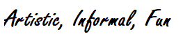
Artistic, informal, and fun. Handwritten fonts are meant to look unorthodox. They convey a playful nature which makes brands that use them seem more approachable and friendly. Typically, smaller businesses that want to emphasise friendliness and customer interactions might use a handwritten font.
Handwritten fonts are exactly how they sound – fonts that are meant to appear handwritten. The purpose of handwritten fonts is to appear informal as this lends a certain atmosphere to the brand. Example fonts include Permanent Market, Knewave, Amatic SC, and Patrick Hand.
Script Fonts
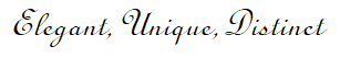
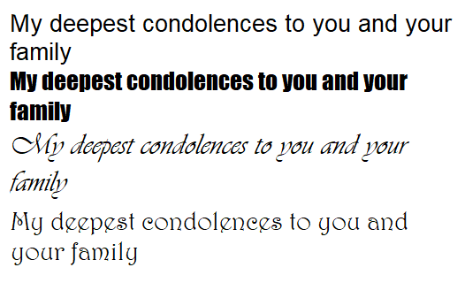
Elegant, unique, and distinct. Script fonts invoke feelings of femininity and creativity. Their handwritten-esque nature makes these sorts of fonts appear more personal. Also, these kinds of fonts typically appear fancier than typical serif fonts so a certain air of luxury can also be imbued into them. However, while these fonts might look artful and fancy, they may sometimes be difficult to read.
Script fonts mimic cursive writing with cleaner lines to aid in legibility. Look at many luxury brands and you may see a lot of script fonts due to its fanciful nature. Script fonts are to evening nights out as serif fonts are to business professionalism. Examples of script fonts include Allura, Pacifico, Lucida Script and brands like Ford and Lindt use such fonts.
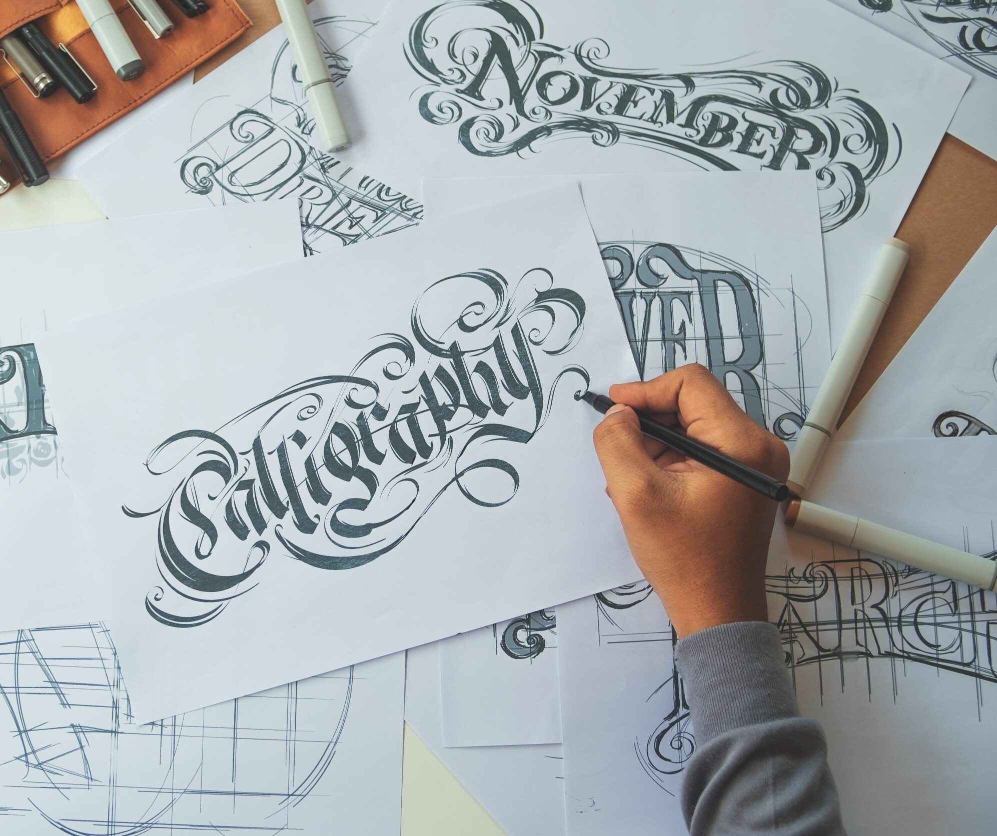
Decorative Fonts
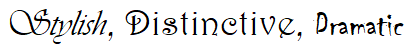
Stylish, distinctive, dramatic. Decorative fonts are a diverse set of fonts that don’t completely and neatly fit into any of the above categories. Instead, those are used as guides and what is ultimately created is a personalised font, tailor-made for a specific brand. These fonts are far removed from the norm and care needs to be taken by businesses to ensure they are an accurate portrayal of the brand and are legible.
Decorative fonts are distinctive and are typically only used for logos where visuals are more important than readability. Decorative fonts can evoke a wide spectrum of emotions by drawing upon design principles presented by other font types. Coca-cola uses a modified version of the Spencerian script font, Disney’s handwritten-esque font is visually distinctive, and IBM stylises the slab serif font style.